When you’re lost, the last thing you want is to be confused about where to go. That’s why wayfinding signage is so important. This type of signage helps people find their way in and better understand unfamiliar or confusing environments.
There are four main types of wayfinding signage: identification, directional, informational and regulatory. By using a combination of these four types of signage, businesses and organizations can help people find their way to their destination, identify important information or set behavioral expectations for visitors without any confusion. We’ll take a closer look at each type and discuss some principles for designing effective wayfinding signage systems.
Identification Signage
Identification signage is used to identify a specific location, such as a building or room. This type of signage typically includes the name and logo of the business or organization. Identification signage can be indoors or outdoors and made from a variety of materials, including metal, plastic, wood and glass.
When choosing identification signage, it’s important to consider the environment in which it will be used. For example, outdoor signage needs to be weather-resistant and able to withstand wind, rain and sunlight. Indoor signage should be legible and easy to read. Identification signage can be an important part of any business or organization’s branding strategy. It can help customers find your location, and it can make your business or organization more recognizable.
The most popular type of identification signage is probably the metal sign, which is often seen on the front of businesses. Plastic signs are also commonly used and they come in a variety of colors and styles. Wood signs are less common, but they can be very elegant and add a touch of class or nostalgia to any business. Glass signs are becoming more popular, as they offer a sleek and stylish look.
No matter what type of identification signage you choose, it is important to make sure that it is visible and legible. After all, the whole point of identification signage is to help people find their way!
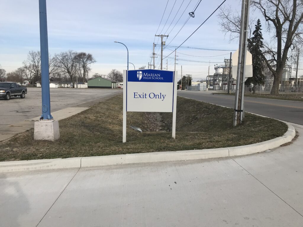
Directional Signage
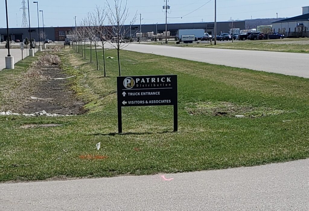
Directional signage is any type of sign that provides information about how to get to a specific destination or helps people orient themselves in an unfamiliar environment. This type of signage can include arrows, maps and instructions. Directional signs are typically found in public places, such as airports, schools and hospitals. They’re also commonly used in private businesses, such as office buildings and retail stores.
Directional signage is an essential part of any business’s customer service, as it can help to keep visitors safe and reduce the risk of accidents.
Directional signs can be used to provide information about emergency exits, evacuation routes and other important locations.
Directional signage can also help businesses to save money by reducing the need for customer assistance. When directional signage is used correctly, it can be an extremely effective tool for businesses and organizations.
Informational Signage
Informational signage plays an important role in our lives, providing us with essential information about the world around us. Informational signage is a type of sign that provides general information about an area. This can include the hours of operation, the facilities that are available, or other important information.
Informational signage is a common way to communicate with people who are visiting an area for the first time, as it can help them to orient themselves and make sure that they are aware of the rules and regulations. In addition, informational signage can be a helpful way to promote safety, as it can provide information about potential hazards or emergency procedures.
In many cases, informational signage is the only way we have of receiving crucial information about our surroundings. For example, imagine if there were no street signs or traffic lights. Drivers would be constantly guessing which way to turn, and accidents would be far more common. Similarly, without informational signage, visitors to a museum would have no way of understanding the exhibits they are seeing. In this way, informational signage is an essential part of our everyday lives.
When designing informational signage, it is important to make sure that the signs are clear and easy to understand. The use of symbols and simple language can be very effective in conveying information quickly and effectively.
Regulatory Signage
Regulatory signage is an important part of our built environment, helping to ensure people follow the rules and regulations that have been put in place for their safety and well-being. Regulatory signage can be found in a variety of locations, from public parks to office buildings, and they come in a wide range of forms, from simple printed signs to complicated electronic displays.
In many cases, regulatory signage is required by law, and failure to comply with the signs can result in penalties ranging from fines to imprisonment. For example, all businesses in the United States are required to post signs informing employees and customers about smoking rules and regulations. However, even when regulatory signage is not legally required, it can still be very effective in influencing people’s behavior.
Regulatory signage can also be used to encourage certain behaviors. For example, many schools post signs asking students to turn off their cellphones during class.
By providing clear information about the consequences of breaking the rules, regulatory signage can help to deter people from engaging in activities that could be harmful to themselves or others.
Design Principles of Wayfinding Signage
There are several design principles that can be used to create effective wayfinding signage. First, the signs should be legible and visible from a distance. They should also be consistent in style, so that viewers can easily identify them as part of a cohesive system.
Additionally, the signs should provide clear and concise directions, using simple language that can be understood by everyone. Signs should be placed in strategic locations, so that viewers can easily find their way to their destination.
Keep in mind these four design principles of wayfinding signage when planning: contrast, repetition, alignment and proximity.
Contrast
Contrast is vital for wayfinding signage because it helps the sign stand out from its surroundings and be easily noticed by people who are looking for it. For example, using a light color on a dark background or vice versa will make the sign more visible.
Repetition
Repetition helps people remember where they saw the sign and how to get back to it if they need to. For example, if all of the signs in a building use the same color scheme, it will be easier for people to remember where they saw a particular sign.
Alignment
Alignment is necessary in wayfinding signage because it helps to create a sense of order and hierarchy. For example, if all of the signs in a building are aligned with each other, it will be clear which signs are more important and which ones are less important.
Proximity
Proximity assists in grouping related information together. For example, if all of the signs in a building are placed close to each other, it will be clear that they are related and people will be able to find them more easily.
By following these principles, you can create wayfinding signage that is effective and easy to understand.
US Signcrafters has 28 years of value, innovation, communication and experience to draw upon when constructing wayfinding signage for our local, national and international clients. Contact us today with your questions or to learn more.
Staff Spotlight
How long have you been in the sign industry?
“I’ve been doing this pretty much all of my adult life. Somewhere around the neighborhood of 35 years now. One morning, I woke and found out I was gonna be a dad and I needed to have a job. So, I got a job in the signage industry that very day and I haven’t looked back.”

What does your position at US Signcrafters entail?
“I do sales work and project development and project management. When a client comes in and says they need a sign, sometimes they do need a sign, sometimes they need something else, or they don’t know really know what they want. I serve as a consultant to help people realize what they can have in three dimensions in the real world, I guess you could say.
I try to give clients the best advice that will advance their brand and their brand exposure out in the world.”
What do you enjoy about the industry?
“The one thing I hate is to be bored, and in the signage industry, everything is so different, it’s hard to get bored. Or at least it doesn’t happen that often in my job. There’s always something else to do, something different to do, to develop.
Of course, people are different. Relating to different people in the world is a challenge sometimes, so relating to the different personality types — everything works together to keep me from being bored, which is the number-one priority in my work life, I guess.”
Can you recall a sign from your childhood that’s seared into your memory?
“There were two moments when I was going to college that proved to be prophetic to my future life. One of them was, I was watching a movie on Victor Vasarely, who’s a pop artist who gained famed in the early ‘70s with those hard-edged paintings of acrylic designs and optical illusions. Some people call it Pop Art — it was very geometric work.
I was watching this movie in art history class one 8 o’clock morning; funny I should make it to that class because I didn’t a lot of times.
But anyways, the movie was about Victor Vasarely and his work, and basically he had an old round-barn studio with his office in the cupelo at the top of this barn. The way that he would work is he had a desk where he would sketch the designs for his painting onto a piece a paper. He would almost do a Paint-By-Numbers thing where he would fill in voids with little numbers so that people would know which color to paint the voids.
He then opened this trap door and threw his paper down to his interns, who, in turn, would paint the paintings and he would sign his name to these paintings. I thought to myself, ‘Oh, dear God, I hope I don’t grow up to be like that because I was to be a fine artist, and my hands will be on every painting.’
And of course, that’s exactly what I grew up to be. I direct the artists. I direct the production people as to what they do. And as it turns out, I grew up to be Victor Vasarely.”
Which project would you consider a career highlight?
“My favorite project happened a couple of years ago at Beacon Health and Fitness in Elkhart. At the aquatic center, there’s a huge room where all the exercise equipment is setup; it’s basically a fitness center for Beacon Health members. And there’s a huge, I dunno, 150-foot long by 30-foot tall wall in there, and the designers in Beacon came up with a design that they wanted to reproduce on this wall.
There was a bunch of triangles with five or six different colors. The triangle motif had shown up in several places around the building, so they were carrying that through with this huge wall graphic in their exercise room.
I took a look at this, and it was very large wall graphic. So, I started in on the project management phase — what was going to be done, how much things were going to cost. I did a cost analysis for the project in vinyl, and it came out to an amount that was pretty reasonable. But I thought to myself, ‘This could look really special if we did something else.’
I talked the client into considering doing this on a three-dimensional basis with varying thicknesses of a plastic triangle that would then indeed be painted the five or six different colors. With the depth on the wall, I thought it would really add something to this project.
When the pricing came in, it was almost seven times higher than the cost for the vinyl, but I thought it was a really good idea. Lo and behold, it was a great surprise to me when decided it was worth the money to invest in it, just to see what happened, I guess, because nothing like this had ever been done for Beacon before.
We had two crews. I think there were five guys who worked on it for several days. It was very complicated because there 160-some triangles that had to be placed perfectly in relation to the other triangles. Everything had to work just right, and, in fact, we did it right on the first try. It just came out perfectly. When you stand back and look at this thing, it gives the resemblance of water. It literally shimmers on the wall. It’s a fantastic piece, and I’m really proud of it.
A woman named Kelly Luna, from the marketing department at Beacon, had designed this thing, and I had pulled it off for her. That was my favorite piece.”